Hope Speaks: Logo

Project Type:
Hope Speaks: Logo
Location
Richardson, TX
Practice Size
20
Timeline
2 Weeks
Modern Dove Logo Design for Hope Speaks Mental Health

Overview

Dr. Shoaf and the team at Hope Speaks Mental Health Solutions approached us with a clear goal: to refresh and modernize their brand identity for the next 5 to 7 years. Dedicated to providing excellent, contemporary mental health services, the practice needed a visual identity that accurately reflected the quality and forward-thinking nature of their clinical work.

The central challenge was to update their dated logo while retaining key symbolic elements requested by the client. The goal was to create a sleek, modern, and unique design that communicates trust, hope, and clear communication, ensuring the brand resonates with clients seeking high-quality mental health support.
Modern Dove Logo Design for Hope Speaks Mental Health

The Problem

The previous logo for Hope Speaks Mental Health Solutions was hindering their ability to communicate the caliber of their practice:

  • Dated Aesthetics: The existing design felt old-fashioned and did not align with the modern, high-quality services provided by the Hope Speaks team.
  • Misalignment with Quality: The outdated visual identity failed to communicate the excellence and contemporary approach of the clinical solutions they offer, potentially leading to a mismatch in client perception.
  • Lack of Sleekness & Uniqueness: The logo was generic and lacked the distinctive, professional quality necessary to stand out in the competitive mental health market, failing to create a memorable brand presence.
  • Weak Brand Storytelling: The design did not effectively link the practice's name, "Hope Speaks," with its core mission of communication and support.
Modern Dove Logo Design for Hope Speaks Mental Health

The Solution

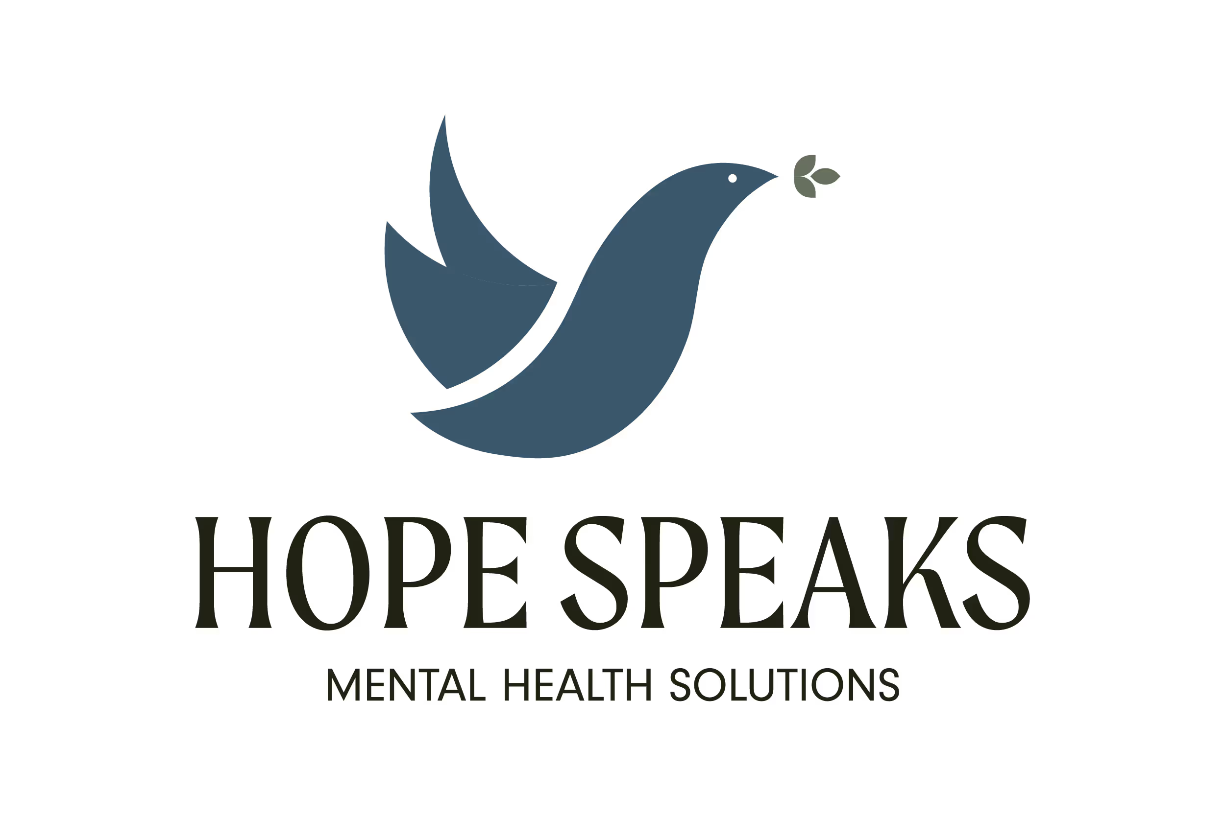
To align the brand with the practice's modern standards and mission, we crafted a new logo that is sleek, modern, and symbolically rich.

  1. Modern Dove Iconography: We developed a sleek and modern dove icon, symbolizing hope, peace, and spirituality. This deliberate redesign stripped away unnecessary complexity, resulting in a clean, professional, and unique brand mark.
  2. Integrated Olive Branch Symbolism: The traditional olive branch, a requested element for continuity, was integrated in a dual-purpose manner. It not only represents peace but is also strategically placed to visually suggest the act of speaking or communicating—a direct nod to the practice name, Hope Speaks.
  3. Clean Typography: A modern and sleek font was carefully selected to complement the icon. This choice ensures readability, conveys professionalism, and further reinforces the practice's commitment to contemporary, excellent service.
  4. Welcoming Color Palette: We chose a welcoming and trustworthy blue as the primary brand color. Blue is globally recognized for communicating trust, stability, and intelligence, essential qualities for a mental health provider.

The Result

Hope Speaks Mental Health Solutions now possesses a compelling, forward-looking logo that accurately communicates the excellent, modern services provided by Dr. Shoaf and the team. The new brand identity is sleek, unique, and serves as a powerful visual representation of their mission to facilitate therapeutic communication and deliver hope. The logo is now prepared to serve as a strong, credible foundation for the practice's branding for the next 5-7 years.